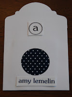
I hate, hate, hate, hate glue. It's icky and picks up any little bit of dirt or lint on your fingers. It makes your fingers yicky and dirty. Hate it. So I'll wait for S to get home to work on gluing the remaining 122 escort cards. In the meantime I'm working on escort card layout. I've come up with the following options.
small monogram, small font:

small monogram, large font:

large monogram, small font:

large monogram, large font:

small monogram, large font below fabric:

small monogram, small font below fabric:

large monogram, small font below fabric:

large monogram, large font below fabric:

large monogram, large font and table name below fabric:

and finally, small monogram, large font and table name below fabric:

All of the options without table names would have a supplemental table name on the back of the card. Which option do you like the most?
 large monogram, small font:
 large monogram, large font:
 small monogram, large font below fabric:
 small monogram, small font below fabric:
 large monogram, small font below fabric:
 large monogram, large font below fabric:
 large monogram, large font and table name below fabric:
 and finally, small monogram, large font and table name below fabric:


4 comments:
I like the last one the best! And I love the fabric and how it coordinates with the napkins you (mostly S I hear) sewed for the tables. I think you should quit law and be an event designer!
You are insane. Wanna plan my wedding?
I vote for one that isn't there: small monogram, small font, and table name on the front. I definitely think table name should be on the front. Not sure everyone would be bright enough (possibly myself included) to look at the back. I don't know what you mean by your last question in the post so I can't comment on that.
I agree w/ Bridesmaid G!
Post a Comment